
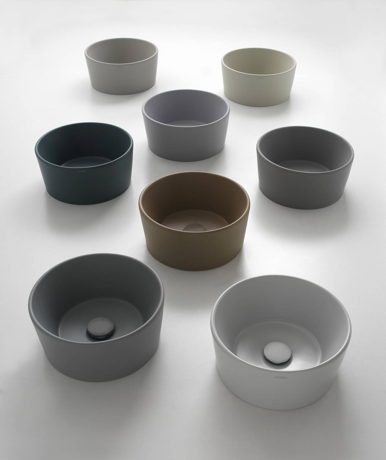
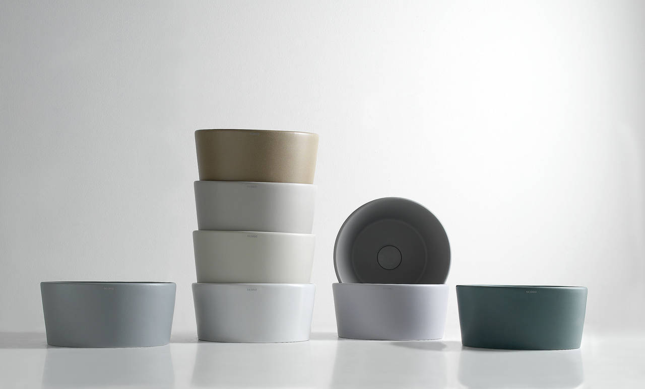
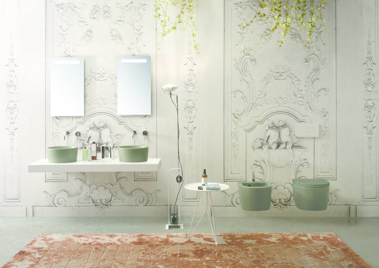
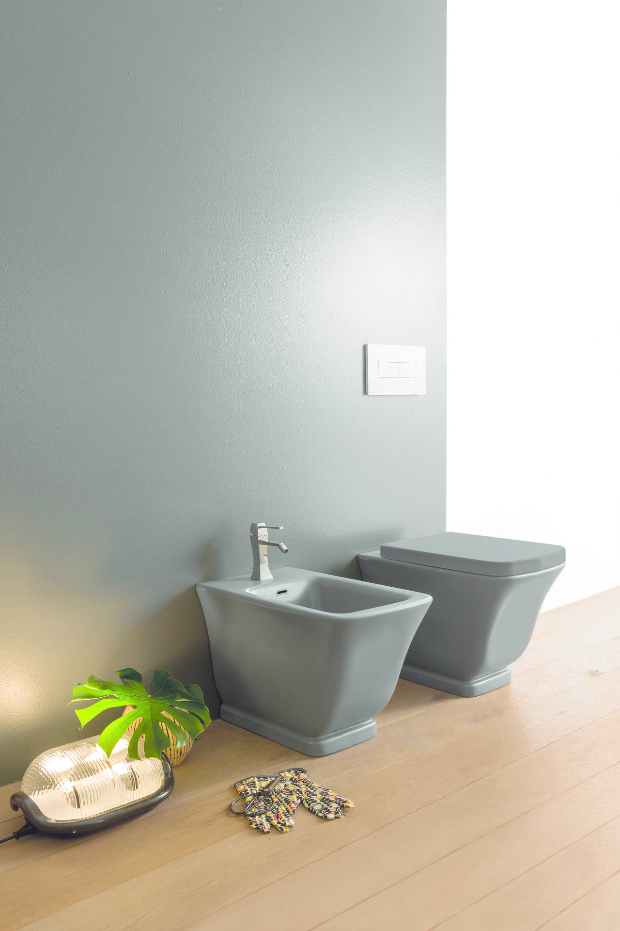
Light, delicate hues with evocative names recalling nature and matter, references and images that come to us from far away, from remote memories, from traditions native to the human heritage: Ceramica Globo’s research focuses on the theme of colour and its expressive potential born out of dialogue with ceramic. Colours ranging from the warm hues of cashmere, chestnut and suede to colder hues such as agate, dew, pearl, mauve and matt white go perfectly with bolder colours such as matt black and petroleum green: the Bagno di Colore palette, created in collaboration with CreativeLab+, is a range of 14 ceramic colours that multiply the company’s compositions and collections, such as Stone, Relais, 4ALL, Bowl+ e Stockholm, designed by the Swedish trio Claesson Koivisto Rune, tomention only a few.
Colour, an eternal element that has been a part of our imagination for as long as we can remember, changes our perception of every component in the bathroom, becoming a design tool capable of “transforming” volumes and surfaces and giving them a plastic appearance that changes with the light.


