
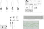
architect: Furch Design+Production
location: Stuttgart, Germany
year: 2012
What is your favourite colour? What colour does your projects identify with the most?
Gaudy, rainbow, gradients, pastel colours, bright colours, neon colours but also nice earthy tones.Often we prefer solid-coloured materials over just colour-coated ones, the colour of materials.
Some are black, some are colourful, some are just red or white or white and turquoise… it’s really different all the time. There’s a big influence by the materials we use (e.g. wood, natural stone,…) plus the colours we want to bring in to spice things up.
Light, material, colour: how do the three elements dialogue in yours projects?
Ideally all three accentuate each other in the most positive way which influences the space and how we feel in it in a sense, that makes visiting the space an unforgettable experience. And after all it’ll be great, when that experience would make people think about the spaces they live and move in, when they question how could it be, how can it be different.
How much does the colour count for the success of yours projects?
Sometimes, when we design a technical model for an exhibition which explains a fuel-cell to kids, then colour is reduced to the minimum and we focus more on the technical function of the whole thing. In other cases we don’t add colour because the materials we use are really strong or the client prefers a minimal approach or the interior/furniture/product serves a product (the counter in a bakery for instance) which is in the foreground. But then there are also projects, where we think that they need colour. Because their context can deal with it; because the context would be happy about some colour or simply, because often things make more fun, when they are in a colour instead of black and white, which we all know aren’t really colours.
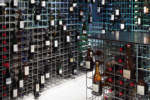
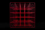
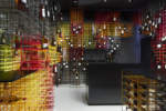
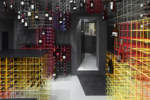
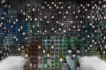
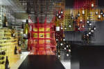
What role does colour play when designing an interior project, and in particular, for your Wine merchant Kreis?
For the wine merchant colour came really late into play. First we imagined the wire-cubes to be made of brass-rods. After a first prototype in that shade we were shocked because it all looked like a weird bird-cage. Then we went down in our workshop and simply chose some leftover colour and spraypainted the prototype with it. We instantly liked the result ad drew up a design with it. Later we identified the possibilities we gained through the use of colour: the whole experience seemed to become more fresh, the colour would act more as an attractor to the people outside and also it could serve as what we call a “soft orientation system”. It guides customers to an area within the store instead to guiding them to a specific bottle. So burgundy vintages might be found in the blue-ish area. Customers are invited to explore the products that way, the shopping-experience changes. I guess generally we use colour in a pretty intuitive way, sometimes we're absolutely sure about it, sometimes we try it out, and see what happens.


