
Marco Casamonti: Oikos is synonymous with color and materials for architecture, topic to which this special issue of Area 127+ is devoted. How do these two elements get along together and how to they relate to one another to find balance and harmony? Are there any particular incompatibilities or affinities between specific colors and materials?
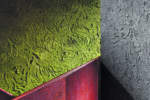
Claudio Balestri: Color and materials are the fundamentals of spatial construction; they define its quality, function and meaning. Typically, the color contributes to define our qualitative perception of the space and the places where we live: in other words, it is the basis of processes of selection and the recognizability of spaces. In Oikos’s case, we have undertaken a complex process of study and experimentation that has enabled us to establish a direct relationship between color and material. The texture of the color and the shading of the material become paradigms of a new way of viewing spaces and Interior decoration. Color and material together Interact, evolve, mature and become the means whereby rooms define their existence.
Nel caso di Oikos è stato intrapreso un complesso percorso di studio e sperimentazione che ci ha permesso di mettere in relazione diretta colore e materia. La matericità del colore e il cromatismo della materia sono diventati paradigmi di un modo nuovo di pensare agli spazi e alla decorazione di interni. Colore e materia insieme interagiscono, evolvono, maturano e diventano la cifra attraverso la quale gli ambienti delineano la propria esistenza.
M.C.: Perhaps erroneously, color is often considered a “finishing” element, a surface coating, or a choice to make as the final “touch” in the realization of a space. What is your experience, however, and your viewpoint, Does color have a role in the design process, whether of an architecture, an interior or an object? Should it?
C.B.: Conceptually, it is an error to think that the color should be decided only in the final stages of a project. The project should already have its color in it. The designer, the visionary, the artist of places, thinks of the spaces and their color definition at the same time. In architectural projects, color has gained more and more importance, both in the definition of the structure and of the architectural spaces,
and in facilitating the orientation and communication of the interior elements and the façade.
To define what we mean by “designing the color” we have to take account of a number of aspects that affect this operation, linked to areas that are not only architectural. There are many complementary disciplinary sectors Involved, for example: history, psychology, sociology, esthetics and anthropology.
Color affects our perception of the environment around us, influences the behavior of the people who interact with it, and even our own behavior. Color helps us identify objects and interpret the environment; it tells us where we are and guides our orientation in space and time, indicates pathways and dangers and enables us to assess the passage of time: day to night, seasons, etc.
We receive sensory stimuli from colors that go beyond sight to interact with other senses as well: touch, smell, taste, hearing and the perception of distance and shapes.
The color of a project has to follow the principles of harmony and efficiency to make our environment comfortable and a source of psychophysical wellbeing. The improper or illogical use of color, on the other hand, creates unpleasant feelings and a sense of disorientation.
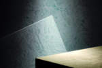
Color is light: it is important to bear in mind that light and color can be used in complementary ways to accentuate an effect, or highlight contrasts, to create a balance or to cancel each other out.
M.C.: In your company, a great deal of effort and resources are devoted to research, innovation and the reinterpretation of the significance of color viewed as indissolubly linked to material and its physical quality. The result of these efforts is enclosed in a series of monographs entitled “The Sense of Matter”. What lies behind the need to develop this research on new surfaces for architecture?
C.B.: I don’t know how many times during these past years we’ve asked ourselves the ultimate meaning of our work. We paint manufacturers are producers of colors that become matter, that redefine space, that transform the existing world. Then, year after year, we found ourselves being drawn repeatedly into initiatives that from color, our color that had become matter, led us to art, architecture, to dreams, to a rewriting of the environment so vital for man. We told ourselves that we wanted to improve people’s lives with color. But even that wasn’t enough. And we realized that this research process we had undertaken has a point of arrival that is a new departure, time after time. The idea of color, of the surface to be painted, was not enough; we wanted to interact not only with the surfaces of buildings and objects, but with the structure, the underlying concept of things. To be a part of the architectural project from the beginning. We realized that the solution was not far from us, we only had to go back to the foundations of Italian decorative tradition, study its basic motivations and recreate them in a contemporary key. That is how, alongside the paints and colors, we arrived at the textures. The new sense of matter.
M.C.: In this research work, do you collaborate with consultants outside the company? Designers, artists, sociologists?
C.B.: Our reference to the great Italian decorative and cultural tradition has been fundamental: the historical examples showed us the way. Our work is the product of the dedication and enthusiasm of our group of decorators, chemists, IT personnel and art directors in an attitude of constant research and discovery to build the process day by day.
We met directly with architects, designers and historians who enabled us to improve and refine our products and technology, year after year. Project managers know we are always ready to question our methods and beliefs in order to find original solutions, and now we are able to produce and create continuous new decorations, often deriving directly from their needs.
M.C.: Would it be correct to speak of a “new texture of color”?
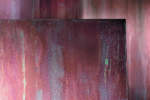
C.B.: For Oikos, color and texture are not two separate things, but expressions of an identical concept of decoration, of a way to work that combines light, surfaces, plays of color, the expressiveness of the living material in a virtuous interplay, a dialogue that is born again, time after time in the mutual understanding between Oikos and the project designers. Color is only one of the elements in this combination, along with texture and the craftsmanship of master decorators.
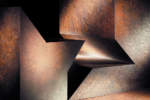
The grain, the weave, the plays of contrast, the depths and density of the surfaces are the instruments that designers can use to give meaning and substance to their ideas. Free of the idea of painting techniques and the logic of “coloring” they can start to think about the effects they intend to achieve in the creation of a setting, and this opens a whole new world of design adventures still to be discovered. The new disciplines of architecture, born to study and emphasize this relationship with light, are concentrating on the control of illumination sources so as to create impressions that change during the day. Materials do not have a single identity, but redefine themselves in their relationship with light. We are on the verge of a new season for architecture.
M.C.: Vibration, Stratification, Transparency, Reflection, Corrosions, Weaves, Absorption: these are the themes into which your product collections are divided. What were the promptings that led you to develop these sectors of research? The demands of the designers, modern development or the desire to respond to the international market?
C.B.: The company philosophy of Oikos combines the importance of the great Italian traditions and decorative culture with a strong vocation for research and innovation. The result is the continuous creation of products that interpret the thinking, dreams and creative choices of interior designers. Oikos’s strength lies also in its ability to adapt an entire industrial product scheme to the stimuli and needs of designers, to the extent even of creating products exclusively for them.
M.C.: Aside from the products illustrated in your catalogues, does Oikos also examine the particular requests of architects or interior designers? Could you describe a few cases?
C.B.: We think of every product in a different way because no project is the same as another, no structure, no place. The challenge for us is to create complex materials capable of interpreting all that is unique in every project.
We want to create colors capable of transmitting the widest range of emotions. We work from a need to be different, but we try not to force anything. We are ready to interact with interior designers, their vision, their needs. We reach the point of producing new decorations and texture on demand, even, working with some of the greatest interior designers.
But our attention is not limited to the stage of choosing the material and color. After decades of experience we know very well that that is only the beginning. That is why a team of our experts is always ready to assist the designer in all the different stages of realization of the project: from the very first steps, when the different textures are examined, to the time of application at the worksite, to resolve any critical points.
M.C.: How has the use of color changed over the years in architecture, both with regard to interiors and also to exteriors?
C.B.: It isn’t an evolution in time so much as one connected with the search for meaning. The great interior designers have never overlooked this dimension, and have always traveled the virtuous route of the project as a “unit”. Certainly, in our everyday activity, we may encounter less virtuous attitudes.
M.C.: Is there, in sociological and cultural terms, a sort of “geography” of colors for architecture?
C.B.: The use of a color is almost always linked to the geographical, historical and cultural context of the place where it is used, and acquires significance from those aspects, in a reciprocal exchange of interdependence.
In the architectural history of a place, a color linked to tradition is chosen and maintained by experience, connected with factors that are both cultural and practical (the availability of the materials in the place, interaction with the sunshine, etc.) A good example are the red roofs of Rome, common since imperial times, made of baked clay. Another example are the houses and monuments of the Mediterranean areas, characterized by the light yellow of tuff bricks or the white of lime. Light colors absorb sunlight and heat much less that dark ones, keeping the interior fresh and cool. In short, color is marked with the profound traces of the history of a people, its identity and its relationship to the land.
Since 1984 Oikos produces color and material for sustainable architecture.
This is a company is committed in the research to create products of great aesthetic impact with absolute respect for the environment, thanks to a production run without energy loss, which is set on the reuse of waste materials of their own and others work on the use of raw materials selected according to the criteria of maximum sustainability.
Oikos materials born in the industrial sector but become “craft“ in the application of decorators.
So the old catalogs today are volumes that classify artistic dialogue between light and matter: the Monographs. This commitment has earned the award “Economia verde di Legambiente“ in 2011 and the inclusion in the ADI Design Index in 2012.


