
architect: Designers Journey
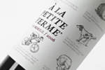
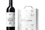
Á la Petite Ferme
The client wished to transmit the rustic atmosphere of Madiran in South-West France which is a simple countryside area as opposed to surrounding wine departments, often characterized by chateau´s and castles. The idea was to transmit an unpretentious "every day feeling" and to open a window to the smells, sounds and impressions of a simple life in the countryside. We wanted to create an identity that would reflect this authentic background by melting humor and pairing suggestions with intimate and nostalgic values.
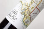
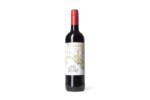
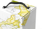
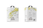
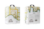
My World
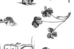
We were asked to develop the design for a family of selected wines from the new world, pinpointing the best from each continent. Wine is an endemic product. The fruit of a specific area with a unique character. We were looking for a way to reflect the character of each continent while maintaining a consistency in the product family. We decided to wrap each product in its own origin accompanied by a selection of illustrations of local flora/fauna and culture. Inspired from old illustrated and colored maps from the 16th. Century we created a series of hand drawn maps that embraces each box.
In this way the product family was easily recognizable whilst each product stands out with a unique identity. We wanted to create a modern packaging without choosing a minimalist direction but with a completely handmade artwork.
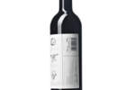
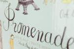
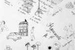
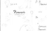
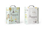
Promenade
Redesign of an existing white wine; Promenade Bag in box. The wine is a VDP L'Herault from the South of France, the biggest wine region in France which in the last 40 years has moved the focus from quantity to quality wines. The goal was to strengthen the Promenade concept with a selection of charming and positive French clichés. We developed a set of key values: A walk through France. Souvenir de Paris. Romance, elegance and charm.
We worked with more detailed hand drawings compared to the existing artwork with the ambition of recruiting a younger consumer segment as well as being recognizable to the existing loyal consumer group. Most of the text, including the brand name, is handwritten to strengthen the romantic and authentic expression. The background colors are inspired by the French macarons. The generic illustrations of food on the old box are turned into selected French recipes on the back of the BiB and the format itself enhances a more sophisticated and proud look.
Designers Journey is an independent, multi-disciplinary and award winning design agency founded in 2005. We work within a variety of fields with a background as product designers. We approach our work in a holistic way and base our choices on method and analysis rather than mere aesthetics. We apply a rigid method of analysis to interpret a brand philosophy or position prior to develop our art. We pride ourselves to make every new commission the best in its category, providing relevant and successful solutions for our client. To do so we approach each project from an unexpected angle in order to deliver solutions that stand out with a desirable personality. Our work is characterized by a deliberate and crafted aesthetic that repeatedly has proved to manage the commercial battle of the shelves.


